The beauty and functionality of a website are paramount for businesses aiming to make a significant digital impact. However, in their quest to build the perfect website, web designers often stumble upon several pitfalls that can hamper the user experience and, consequently, the brand’s online success.
Recognising these common web design mistakes and understanding how to avoid them is the key to crafting a website that looks good and performs exceptionally well. This article explores the top ten web design mistakes and provides practical guidance on how to avoid them.
1. Neglecting Mobile-First Design
It is vital to ensure your website is optimised for mobile devices. Statista said mobile web browsing accounted for 52.4% of global website traffic in 2018. This staggering figure underlines the importance of adopting a mobile-first design approach.
Why Mobile-First Design is Crucial
Having a website that caters to mobile users is not just about offering convenience but also about improving your website’s visibility on search engines. Google’s mobile-first indexing approach prioritises the indexing and ranking of mobile web pages. If your website is not optimised for mobile, it will not perform well in Google search results.
Tips for Mobile-First Design
Here are some tips to ensure your website design is mobile-friendly:
- Responsive Design: Ensure your website design is responsive. This means it should automatically adjust to fit different screen sizes, providing a seamless user experience across devices.
- Readable Text: Make sure the text on your website is easy to read on smaller screens. Avoid using tiny font sizes that may require users to pinch-to-zoom.
- Easy Navigation: Navigation should be clear and straightforward. Avoid using complex menus that may be difficult to use on mobile devices.
2. Cluttered Site Navigation
An intuitive and easy-to-navigate website is critical to providing a positive user experience. However, many websites fall short in this area, offering too many links and options that can confuse users.
The Problem with Cluttered Navigation
When a website’s homepage (or any other page) is cluttered with numerous links, options, and images, it creates a sense of chaos. Users may find locating the information they need challenging, leading to frustration and a higher bounce rate.
Tips for Clear Navigation
To enhance your website’s navigation:
- Limit Options: Try to limit the number of options on your menu. Too many choices can overwhelm users and make finding what they want challenging.
- Use Clear Labels: Use clear and descriptive labels for your menu items. Avoid using jargon that may confuse users.
- Group Related Items: Group related items together under broader categories. This can help users find what they need more quickly.
3. Slow Page Load Times
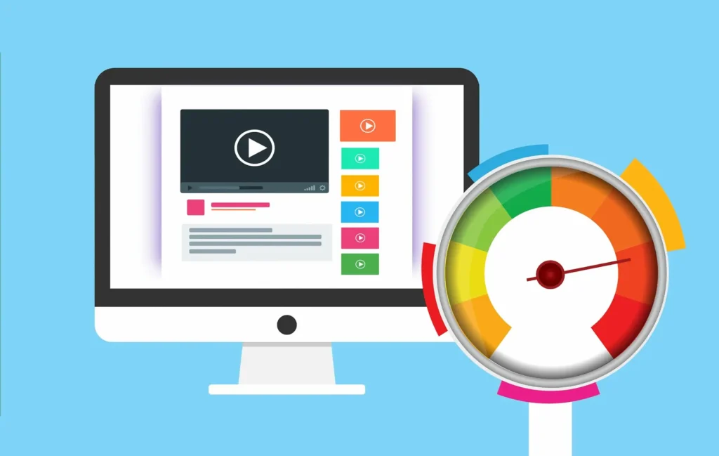
In a world of high-speed internet, users have little patience for slow-loading websites. According to Neil Patel, a 1-second delay in page load time can lead to a 7% reduction in conversions.
The Impact of Slow Page Load Times
Slow page load times can significantly impact your website’s performance. Not only can they lead to higher bounce rates, but they can also affect your website’s ranking on search engines. Google considers page speed a ranking factor, meaning slower websites will likely rank lower in search results.
Tips for Improving Page Load Times
To improve your website’s load times:
- Optimise Images: Large, high-resolution images can significantly slow down your website. Use image compression tools to reduce the file size of your images without compromising on quality.
- Minimise HTTP Requests: Each element on your page (images, scripts, CSS) requires a separate HTTP request to load. The more on-page components, the longer it takes for the page to render.
- Enable Browser Caching: Browser caching allows elements of your website to be stored in a user’s browser, reducing the time it takes to load your website when they revisit.
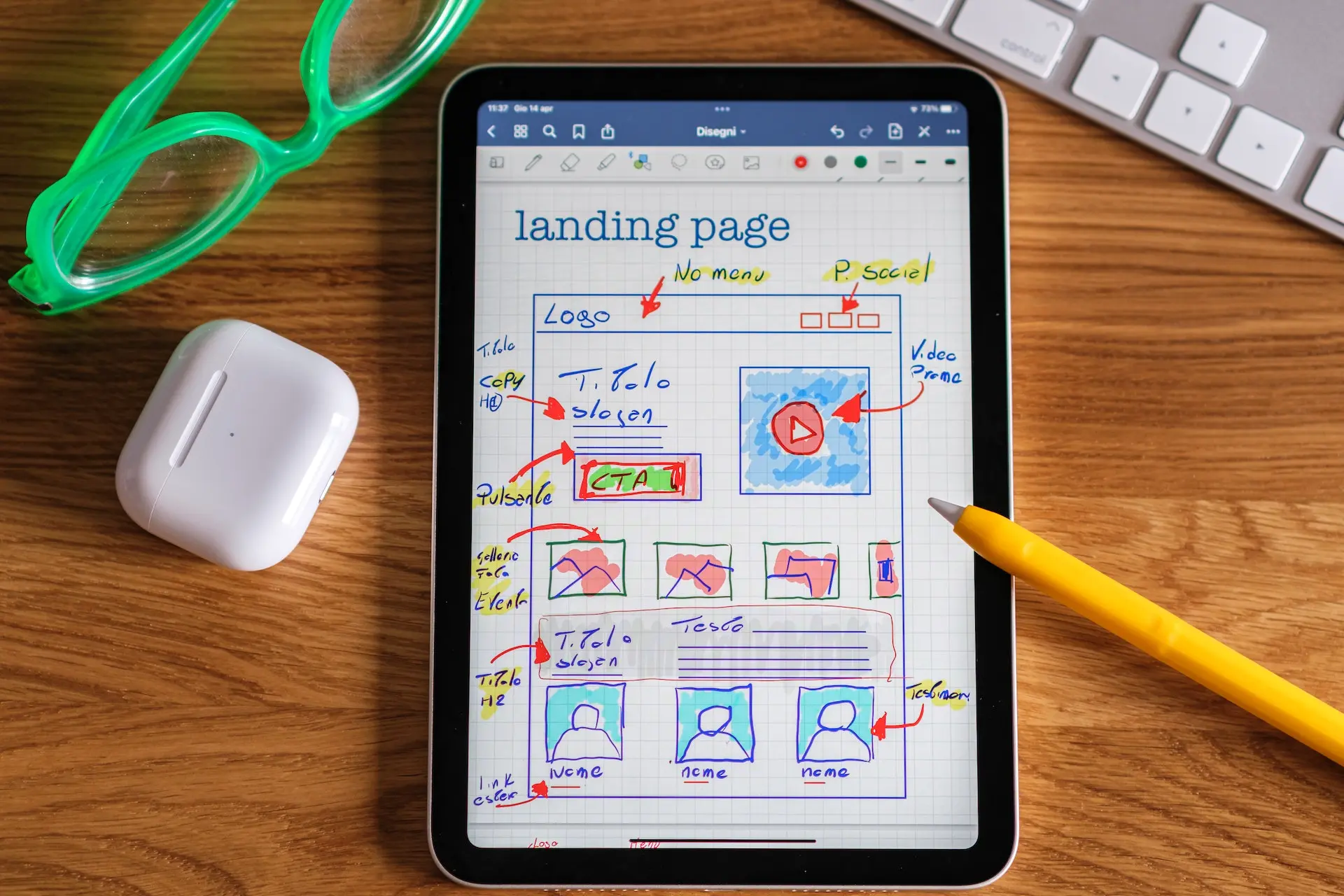
4. Misplaced Call-to-Action (CTA)
Call-to-action (CTA) buttons guide users towards desired actions, such as signing up for a newsletter or purchasing. However, if your CTAs are not strategically placed, they may not effectively drive conversions.
The Importance of CTA Placement
The placement of your CTA can significantly impact its visibility and, consequently, its effectiveness. If your CTA is placed at the very bottom of the page, users may not scroll down far enough to see it. Conversely, users may not be ready to take action if it’s placed too early.
Tips for Effective CTA Placement
Here are some tips for effective CTA placement:
- Place CTAs Above the Fold: Placing your CTA above the fold ensures it is visible when a user lands on your page. This can help increase the likelihood of users taking the desired action.
- Use Contrasting Colours: Your CTA should stand out from the rest of your page. Use contrasting colours to make it pop and draw users’ attention.
- Make It Action-Oriented: Use action-oriented text in your CTA. Phrases like “Sign Up Now” or “Download Free Ebook” tell users exactly what action they’re taking.
5. Unoptimised Images
While high-quality images can enhance your website’s aesthetics, they can also significantly slow down your page loading times if not optimised.
The Impact of Unoptimised Images
Unoptimised images can significantly impact your website’s speed and performance. Large image files take longer to load, slowing your page speed and potentially leading to higher bounce rates.
Tips for Image Optimisation
To optimise your images:
- Compress Images: Use image compression tools to reduce the file size of your images without compromising their quality.
- Use the Right Image Format: Different image formats have strengths and weaknesses. Use the format that best suits your needs.
- Implement Lazy Loading: Lazy loading is a technique that delays loading non-critical resources (like images) at page load time.
6. Irrelevant Pop-up Implementation
When implemented correctly, pop-ups can be an effective tool for generating leads or newsletter subscribers. However, if executed poorly, they can obstruct users from consuming the primary content and lead to a frustrating user experience.
The Problem with Irrelevant Pop-ups
Irrelevant pop-ups that appear too frequently or too soon can disrupt the user’s browsing experience. Users may find these pop-ups annoying and may choose to leave your website.
Tips for Effective Pop-up Implementation
To effectively implement pop-ups:
- Time Your Pop-ups: Don’t display your pop-up when a user lands on your page. Give them some time to browse your content before showing the pop-up.
- Make Your Pop-ups Relevant: Ensure your pop-ups are relevant to the content on your page. Irrelevant pop-ups can frustrate users and cause them to leave your website.
- Provide an Easy Exit: Make sure users can quickly close your pop-up. Users may get frustrated and leave your site if it’s difficult to close.
7. Poor Font Choice
The fonts you choose for your website are crucial in its usability and readability. If users find your text difficult to read, they will likely leave your website.
The Impact of Poor Font Choice
Poor font choice can negatively impact your website’s readability and overall user experience. If your text is too small, users may struggle to read your content. If your font style is too decorative or unusual, it may distract users and make your content difficult to understand.
Tips for Choosing the Right Fonts
When choosing fonts for your website:
- Prioritise Readability: Choose fonts that are easy to read. Avoid decorative or script fonts for large blocks of text.
- Limit Font Variations: Too many fonts can make your website look cluttered and disjointed. Stick to two or three complementary fonts for a more cohesive look.
- Consider Mobile Users: Ensure your fonts are legible on smaller screens. Some fonts may not scale well on mobile devices, making your text difficult to read.
8. Outdated Content
Keeping your website’s content updated is crucial for maintaining relevance and credibility. However, many websites fail to regularly update their content, leading to outdated information that can frustrate users.
The Importance of Keeping Content Updated
Keeping your content updated ensures your website remains relevant and provides value to your users. Outdated content can confuse users and make your website appear neglected or unreliable.
Tips for Keeping Content Updated
Here are some tips for keeping your content updated:
- Regularly Review Your Content: Review your content to identify outdated or irrelevant information.
- Update Your Blog: Post new content regularly if you have a blog. This not only keeps your website fresh but also helps with SEO.
- Check Your Links: Ensure all your website links are working. Broken links can frustrate users and harm your SEO.
9. Overemphasis on Social Media Links
While social media is an essential marketing tool, placing too much emphasis on social media links on your website can distract users from your content and lead them away from your site.
The Problem with Prominent Social Media Links
Placing prominent social media links at the top of your page can divert traffic from your website and towards your social media profiles. This can result in lower engagement and conversions on your website.
Tips for Placing Social Media Links
Here are some tips for placing social media links on your website:
- Place Links at the Bottom: Consider placing your social media links at the bottom of your page or on your contact page. This lets users engage with your content before visiting your social media profiles.
- Use Appropriate Icons: Use recognisable icons for your social media links. This makes it easier for users to find and click on your links.
- Don’t Overdo It: Avoid displaying too many social media links. Stick to the platforms where your brand is most active and where your target audience is likely to be.
10. Lack of Website Security

Ensuring your website is secure is crucial for protecting your users’ data and trust. However, many websites fail to implement adequate security measures, putting their users’ data at risk.
The Importance of Website Security
Website security is vital for protecting your users’ data and maintaining your website’s credibility. A secure website is more likely to earn users’ trust, leading to higher engagement and conversions.
Tips for Enhancing Website Security
Here are some tips for enhancing your website’s security:
- Use HTTPS: HTTPS encrypts data between your website and your users, protecting it from cybercriminals intercepting it. Ensure your website uses an SSL certificate to provide a secure browsing experience for your users.
- Keep Your Software Up-to-Date: Outdated software can contain vulnerabilities that cybercriminals can exploit. Keep your website software and plugins up-to-date to protect against security threats.
- Use Strong Passwords: Use strong, unique passwords for your website accounts to protect against unauthorised access.
In conclusion, avoiding these common web design mistakes can significantly enhance your website’s user experience and performance. It’s important to remember that an effective website design is not just about aesthetics but also functionality, usability, and security. By understanding these common pitfalls and knowing how to avoid them, you can create a website that looks good and delivers an exceptional user experience.